Many of us have had to cancel weddings, holidays and well just about everything for the next couple of months! So, for a minute let’s imagine we are still attending our holiday – perhaps we are going to Hawaii and we’ve booked an amazing villa for the week! Imagine this… we open the door to our villa, and we look around the room and think… WOW. Have you ever felt this before? Now imagine if you could get that same reaction from every prospective tenant that enters one of your HMO’s.
This is where colour comes in. Interior designers use colour to evoke certain emotions and feelings – it is a powerful communication tool. So, I ask you: who is your audience and how do you want them to feel when they walk into your property? It’s important to remember that you aren’t designing this property for you – you are creating it for your target market. Understanding their likes, dislikes and what they are looking for in a room is vital when it comes to design. We are going to take you through each colour and what emotions are attached to that colour.
RED
Passionate, Aggressive, Important
Red is a dominant colour which can evoke strong emotions. Brands that use this colour often represent some of these strong emotions as well. As a result of this, red is a colour we would generally steer away from for a HMO. If we want our tenants to feel welcomed and relaxed, we would avoid using a bright red which embodies the emotion of passionate and aggressive. However, if you were to use a more muted, darker shade of red this can embody the emotion of calmness. We wouldn’t use this in excess so if you are unsure how to use this colour effectively, ask a designer.
ORANGE
Playful, Energetic, Cheap
Orange is a much more playful colour to work with which is why we see so much of this colour used within HMO designs. It brings a high degree of positivity and will inspire us to be active – a great colour to use if one of your values is helping the wellbeing of your tenants. It encourages social interaction in a fun way so using this colour within your social space is a great idea. If used too much can be very over-bearing and create a sense of discomfort. So it is best to use this colour as an accent rather than the primary colour.
YELLOW

Happy, Friendly, Warning
Yellow is a difficult colour to use – it is often associated with happiness but can also activate the anxiety centre of the brain. Like orange, you should use this colour sparingly. Lighter shades will play on the happiness aspect, reminding your tenants of the summer and sun. This would be a great accent colour to use to brighten up a space such as the hallway.
GREEN
Natural, Stable, Prosperous
This is a perfect colour to use if your value is the environment! Green mostly represents the outdoors, making it a strong colour to suggest nature and organic qualities. Green also represents stability and therefore is a popular choice amongst interior designers. This is definitely a colour to consider if you want to retain your tenants for longer than 6 months – having a sense of stability and calmness will help them feel more at home. An emerald green can also embody the feeling of luxury and refinement. So if you are trying to achieve to be at the top end of your market then again this would be a great colour to use. An easy way of bringing green into your properties is plants! I’ve heard the stories of tenants killing plants quicker than you thought could happen so look into plants that will last. This will not only add to your colour palette, but it will also lend itself to your tenants wellbeing. If you want to know more about Biophilia and design head over to our other blog post.
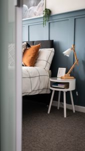
BLUE

Serene, Trustworthy, Inviting
Blue is probably the most popular colour in interior design – and for good reason. Blue is the colour of trust and who wouldn’t want to have this as a key value? It can create a sense of productivity with calming and soothing tones. This is ideal for bedrooms but also useful for bathroom and study/work rooms as it is said to promote intellectual thought. However, this colour is on the cold side of the colour spectrum and can be uninviting if exposed to little natural light. Think about how you can integrate some warmer colours into the rooms to balance this out. For example, instead of using a very light oak floor, consider using a darker warmer wood for your social spaces.
PURPLE
Luxurious, Mysterious, Romantic
Using purple dominantly is an easy way of creating a sense of elegance or high-end appeal. Before you get too excited, I want you to think back to who your customer is. Using purple in a home can feel a little soulless. You would often associate this colour to a high-end hotel or boutique Airbnb – but is this how you want to live? If your target market are 25-year-olds, they are probably more interested in a sense of calm and stability for their home rather than luxury. Interior designers use this colour within residential homes to bring a sense of romance – therefore I’m not sure if this is quite the right colour to use for a HMO!
It all comes down to how you want your tenants to FEEL. If you want your tenants to say “WOW” but you’re not sure how, send us a message and we’ll see how we can help!